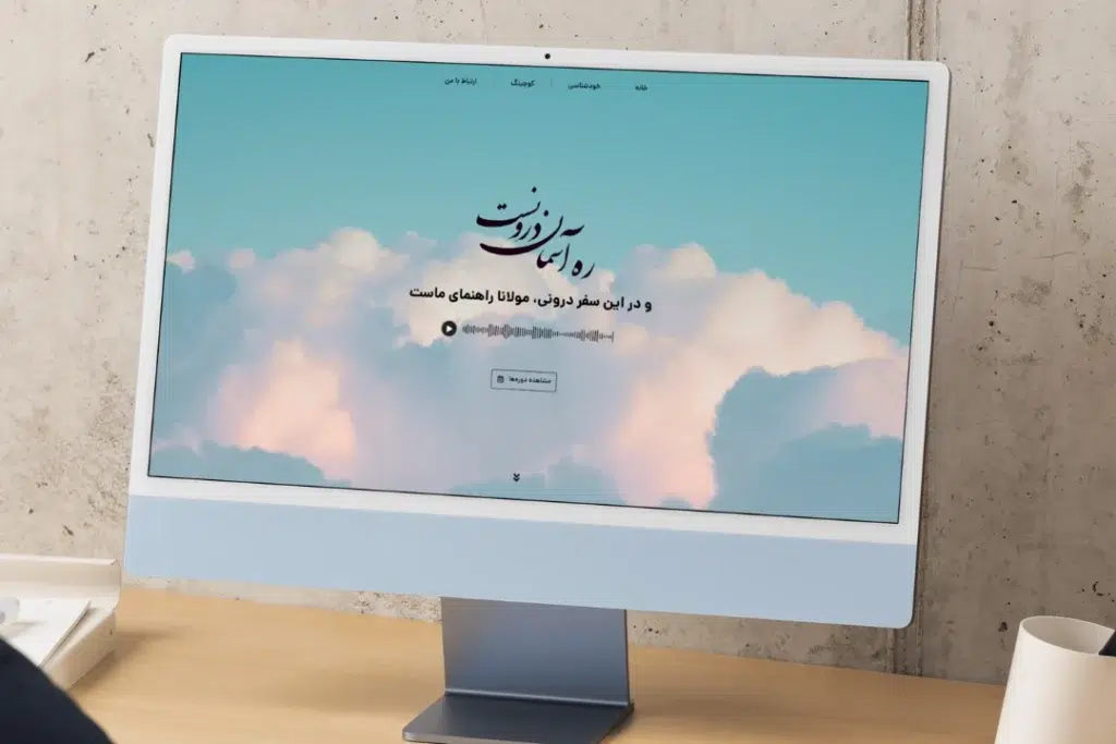
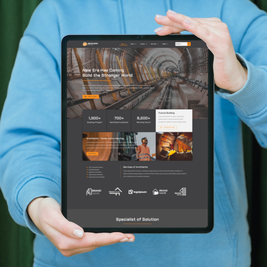
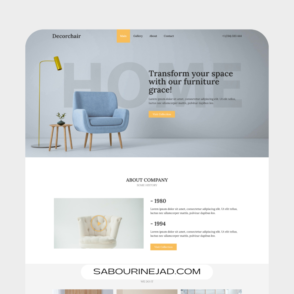
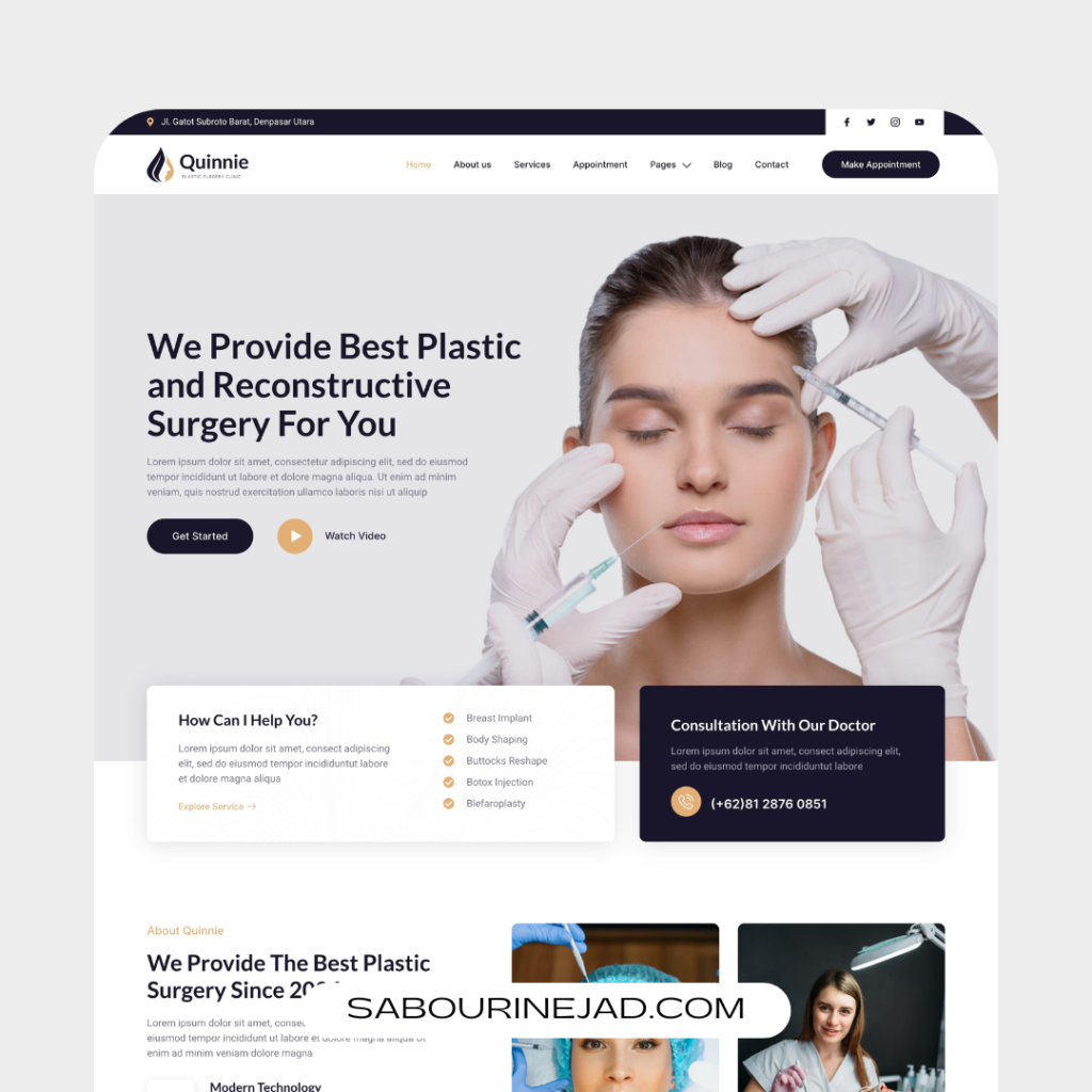
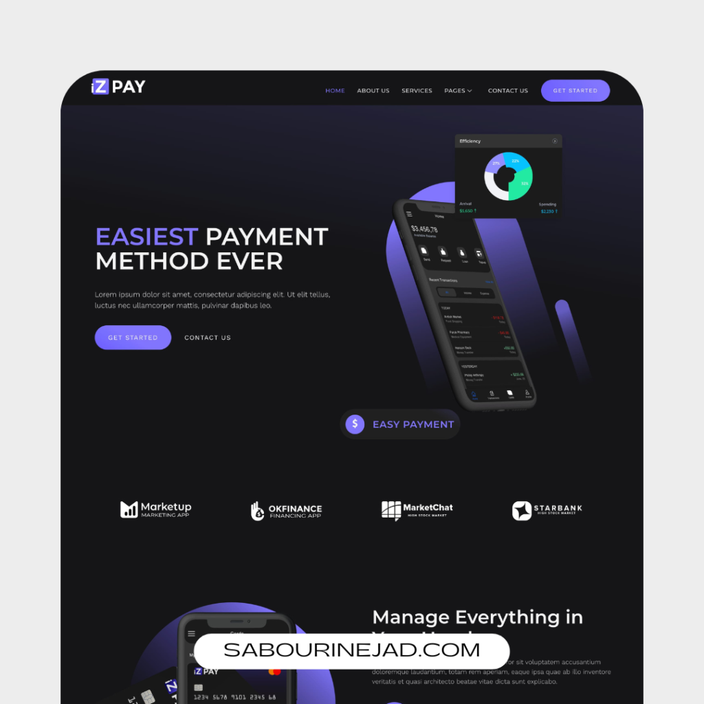
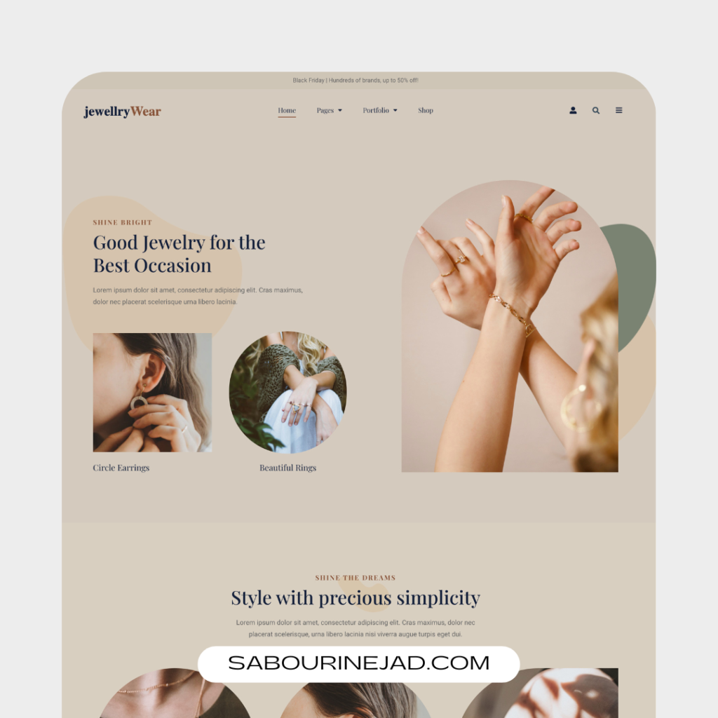
Responsive web design is an approach to web design that allows websites to adapt to different screen sizes and resolutions. The use of mobile devices to access the internet is increasing rapidly, and it’s essential to ensure that websites can adapt to different devices. In this article, we’ll discuss the importance of responsive web design, the benefits it provides, and examples of successful responsive designs.
Benefits of Responsive Web Design:
- Improved User Experience:
A responsive website improves user experience by providing a seamless experience that’s easy to navigate and use. When a website is designed responsively, it adapts to the device that a user is using, providing a seamless experience that’s easy to navigate and use. This improves user engagement and can lead to increased time on site, lower bounce rates, and higher conversion rates. - Increased Mobile Traffic:
With the increasing use of mobile devices to access the internet, having a responsive website is critical. By ensuring that your website looks great and functions properly on mobile devices, you can attract more mobile traffic and improve your search engine rankings. Google has even stated that mobile-friendly websites receive a ranking boost in their search results. - Cost-Effective:
Responsive web design can be more cost-effective thancreating separate versions of a website for different devices. Instead of having to maintain multiple websites, a responsive design approach allows you to create a single website that can adapt to any device. This can save time and resources, which can be especially beneficial for small businesses or startups with limited budgets. - Improved SEO:
Responsive web design can also improve your search engine optimization (SEO) efforts. By providing a mobile-friendly website, you can improve your search engine rankings and attract more organic traffic. Google’s algorithms prioritize websites that are responsive and mobile-friendly, so having a responsive website can help you rank higher in search results. - Future-Proof:
Responsive web design is future-proof. With new devices and screen sizes being introduced all the time, it’s essential to have a website that can adapt to these changes. By designing responsively, you can ensure that your website will continue to look great and function properly, regardless of what devices people use to access it in the future.
Examples of Successful Responsive Designs
Airbnb’s website is an excellent example of successful responsive design. The website adapts to different screen sizes and resolutions, providing a seamless user experience on any device. The images and layout on the website also adjust based on the device, ensuring that the website looks great and functions properly on any screen.
- Starbucks
Starbucks’ website is another great example of responsive web design. The website features a flexible layout that adjusts based on the screen size, with imagesand text adapting to different devices. The website’s navigation menu also changes based on the device, providing an intuitive user experience regardless of the screen size.
- Smashing Magazine
Smashing Magazine is a popular web design blog that has been designed responsively. The website’s layout and navigation adjust to different screen sizes, providing an optimal user experience on any device. The website also features a responsive images approach, ensuring that images are optimized for different screen sizes and resolutions.
- Apple
Apple’s website is another excellent example of responsive design. The website adapts to different screen sizes and resolutions, with the layout and content adjusting to provide a seamless user experience. The website’s navigation menu also changes based on the device, providing an intuitive user experience on any screen.
The Boston Globe is a newspaper website that has been designed responsively. The website’s layout and content adapt to different screen sizes and resolutions, providing an optimal user experience on any device. The website also features a responsive images approach, allowing images to be optimized for different screen sizes and resolutions.
How to Implement Responsive Web Design?
To implement responsive web design, you need to follow some basic principles:
- Use a flexible grid:
Use a flexible grid that adjusts based on the screen size and resolution. This ensuresthat the website’s layout remains consistent and easy to navigate on any device. - Use fluid images:
Use images that adjust based on the screen size and resolution. This ensures that images look great and load quickly on any device. - Use media queries:
Use media queries to adjust the website’s layout and content based on the device. This ensures that the website looks great and functions properly on any screen size and resolution. - Test on multiple devices:
Test your website on multiple devices to ensure that it looks great and functions properly on any device. This includes desktops, laptops, tablets, and mobile devices.
Conclusion:
Responsive web design is essential in today’s digital landscape. With the increasing use of mobile devices to access the internet, it’s critical to ensure that websites can adapt to different screen sizes and resolutions. By designing responsively, you can improve user experience, attract more mobile traffic, save time and resources, improve SEO, and future-proof your website. The examples of successful responsive designs provided in this article demonstrate the effectiveness of responsive design in providing a seamless user experience on any device. So, if you want to create a website that attracts and engages your target audience, responsive web design is a must.