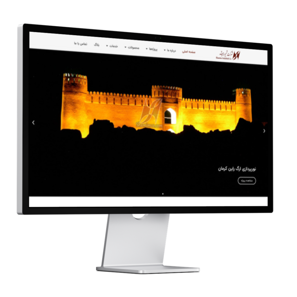
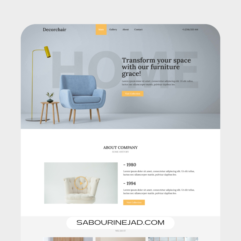
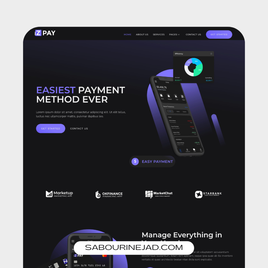
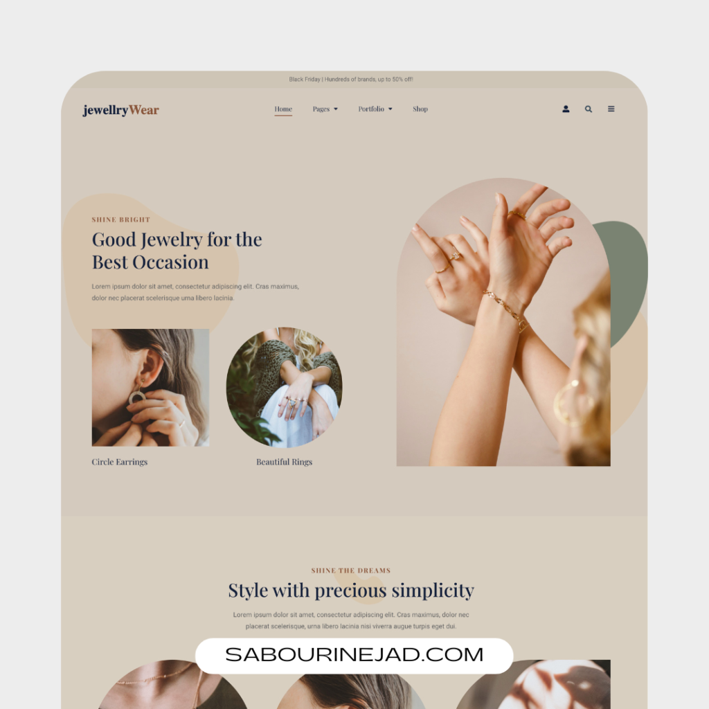
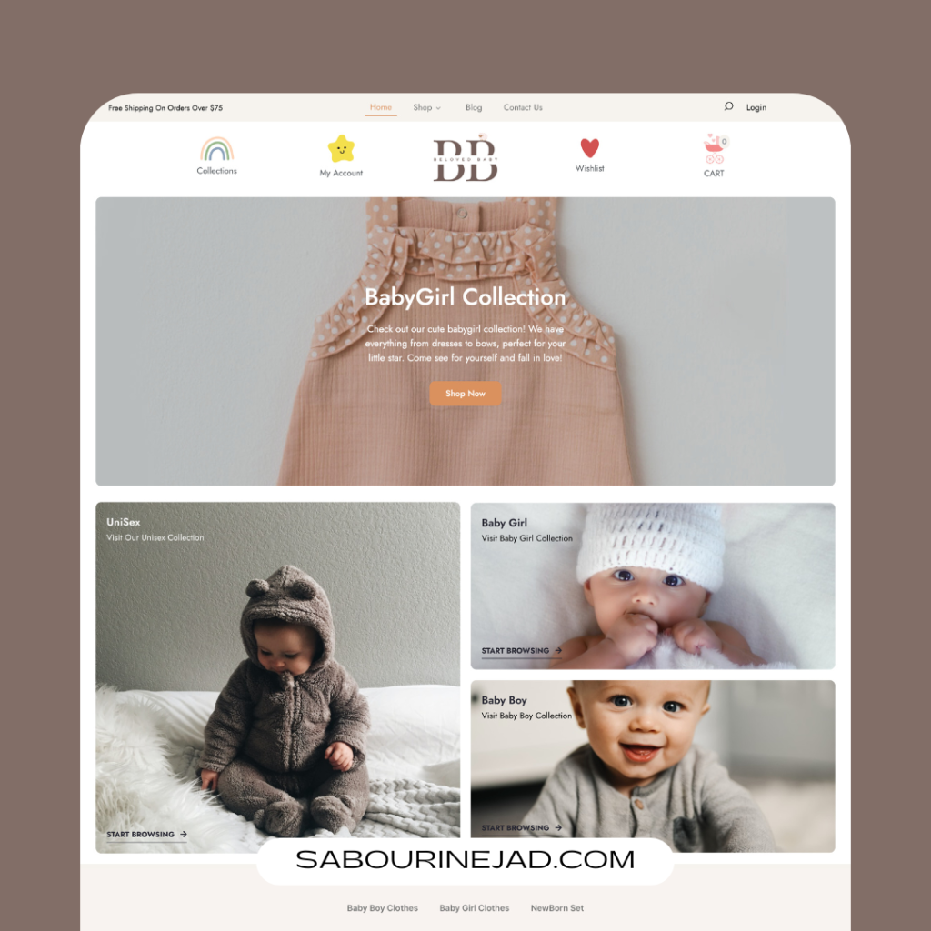
Colors are an essential element in web design. They can evoke emotions, create visual hierarchy, guide user attention, and help build a strong brand identity. However, the choice of colors should not be based on personal preferences or aesthetic appeal alone. Understanding the psychology of color and its impact on user experience and brand identity is crucial for creating effective websites that engage users and convey the desired message. In this article, we’ll explore the role of color in web design, delve into the psychology of color, showcase real examples of websites that effectively use color, and provide tips on how to use color effectively in web design.
The Psychology of Color:
Colors have been studied extensively in psychology, marketing, and design fields. Different colors evoke different emotions, perceptions, and responses in people, depending on culture, context, and personal experiences. Here are some common associations of colors:
- Red: passion, energy, urgency, danger, excitement
- Orange: warmth, friendliness, enthusiasm, creativity
- Yellow: happiness, optimism, clarity, caution
- Green: nature, growth, harmony, health
- Blue: calmness,trust, professionalism, loyalty
- Purple: creativity, luxury, royalty, spirituality
- Pink: femininity, romance, gentleness, sweetness
- Brown: earthiness, stability, warmth, ruggedness
- Black: sophistication, elegance, power, mystery
- White: purity, simplicity, cleanliness, innocence
The Impact of Color on User Experience:
- Attention and Navigation:
Colors can help guide users’ attention to important elements on a web page, such as call-to-action buttons, menu items, or headings. By using contrasting colors, designers can create visual hierarchy and make key elements stand out. This can also help users navigate the website more easily. - Emotional Response:
Colors can elicit emotional responses from users, which can influence their behavior, perception, and engagement. By using colors that align with the brand’s personality and message, designers can create a more meaningful and memorable experience for users. This emotional connection can also help build brand loyalty and trust. - Brand Identity:
Colors can play a key role in creating a consistent and recognizable brand identity. By using a consistent color palette across all touchpoints, designers can help users associate certain colors with the brand and create a distinctive visual identity. This can also help the brand stand out from competitors. - Readability and Accessibility:
Colors can affect readability and accessibility of web content, especially for users with visual impairments or color blindness. By using high contrast and legible color combinations, designers can ensure that their contentis accessible to all users. This can also improve the overall user experience by making the content easier to read and understand.
Real-life Examples of Effective Use of Color in Web Design:
- Apple: Apple’s website uses a minimalist and sleek color palette that reflects the brand’s simplicity and elegance. The use of white space and bold typography creates a sense of spaciousness and clarity, while the use of contrasting colors such as black and white creates a sense of sophistication and timelessness.
- Dropbox: Dropbox’s website uses a clean and minimalist color palette that reflects the brand’s simplicity and efficiency. The use of light blue and white creates a sense of calmness and trust, while the use of high contrast and clear typography ensures readability and accessibility.
- Airbnb: Airbnb‘s website uses a vibrant and diverse color palette that reflects the brand’s global and inclusive identity. The use of bright colors and playful illustrations creates a friendly and welcoming atmosphere, while the use of white space and clear typography ensures readability and simplicity.
- Google: Google’s website uses a colorful and playful color palette that reflects the brand’s innovation and creativity. The use of bright colors and bold typography creates a sense of energy and excitement, while the use of white space and clear hierarchy ensures readability and usability.
- Nike: Nike‘s website uses a bold and inspiring color palette that reflects the brand’s determination and passion. The use of bright and contrasting colors creates a sense of energy and excitement, while the use of bold typography anddynamic imagery creates a sense of movement and empowerment.
Tips for Using Color Effectively in Web Design:
- Define Your Brand Personality:
Before choosing a color palette, it’s important to define your brand personality and message. What values, emotions, and attributes do you want your brand to convey? What is your target audience and what are their preferences and expectations? By answering these questions, you can choose colors that align with your brand identity and message. - Choose a Color Palette:
Once you have defined your brand personality and audience, you can choose a color palette that reflects your brand identity and message. A color palette typically consists of a primary color, secondary colors, and accent colors. You can use online tools such as Adobe Color or Coolors to generate color palettes based on your preferences and objectives. - Use Contrast and Hierarchy:
Using contrasting colors can help create visual hierarchy and guide users’ attention towards key elements on the web page. By using high contrast between text and background, you can improve readability and accessibility. However, make sure to follow accessibility guidelines and test your color combinations for legibility. - Test and Iterate:
Color preferences and perceptions can vary among different users and cultures. Therefore, it’s important to test your color choices and combinations with real users and gather feedback. You can use A/B testing tools such as Optimizely or Google Optimize to test different color variations and measure their impact on user engagement and conversion.
Colors are a powerful toolin web design, and they can impact user experience and brand identity in significant ways. By understanding the psychology of color and its impact on users, designers can create more effective websites that engage users and convey the desired message. The use of color should be intentional and strategic, reflecting the brand’s personality and message while ensuring readability and accessibility. Real-life examples of effective use of color in web design can provide inspiration and guidance for designers. By following the tips for using color effectively in web design, designers can create visually appealing and engaging websites that leave a lasting impression on users.


